the art of Don't Starve
The Game
One of the games I liked the most in the last decade was the survival game by Klei Entertainment called Don’t Starve.
This game is an amazing example of what happens when developers and artists embrace rough edges and lean into the idea of something being hard and unforgiving. With very little direction you are dropped into a strange world and from there on it’s trial and error, and there’s going to be a lot of error. In a world of games giving out participation medals, Don’t Starve is a breath of fresh air. Aside from incredible game play and an immersive and creepy narrative (I won’t spoil anything) the art style is the thing that struck me and stays with me until this day.
The style is simple and leaves a lot of room for expansion. New characters, different items, creatures and even the UI are all done with the same style which makes the whole game feel more like an experience instead of just another game.
Meet Wilson
Let’s take a look at Wilson the main character.
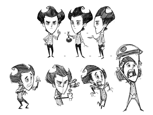
You can almost imagine this drawn in a notebook. It’s cleaver because it allows the artists and animators to not focus so much on how the hair is positioned or what lines are slightly out of place frame to frame, which would look complete off in a different style of game. Instead they can focus on iterating quickly, adding a multitude of different subtle gestures allowing Wilson to hold and interact with every thing in the game without looking out of place. If anything the rough nature of this style of drawing adds to the atmosphere of the game and makes it feel incredible.
The World
So what about the world in which Wilson must not starve.
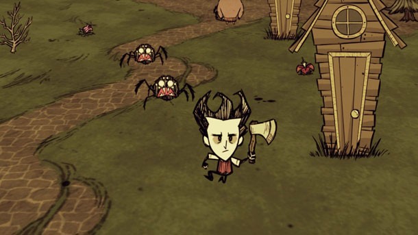
The masterpiece that is the procedurally generated isometric world of Don’t Starve offers many different biomes and a multitude of different monsters, and other things that try to help you fail in your task of staying alive. The art style extends to this as well. Rough ground, creepy flowers and crooked buildings add to the aesthetic.
The simplicity in this design means that if something is slightly off it only looks better in this world. It also allows for objects and items to be located in a number of different locations throughout the world without looking like they’ve been put there accidentally.
Less is More
A pretty common phrase I know but lets see how Don’t Stave absolutely nails this concept.
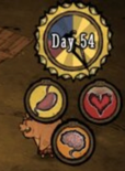
The UI is a pretty simple one and yet it gives so much information. A stomach, heart and brain are the first things I notice. Having played literally thousands of games at this point means I understand that a heart, in this case a slightly damaged heart, means that the character has taken some damage and if it gets lower it’s not going to get better. Since this game is called Don’t Starve I can only assume that the stomach means I will have to feed myself and keep this circle filled to avoid death.
The brain however is an interesting one. It’s not immediately obvious what this is but that only adds to the games charm. As you play and enter different harsher biomes, you notice it declines. When you pick up some flowers, because why not, you notice it increases and suddenly it clicks, it’s sanity. Several other games have this technique of teaching by action instead of berating players with tutorials and Don’t Starve is no exception.
I could go on
But I won’t. I just wanted to share my love for an art style that I hope I will one day pay homage to with my own game. Creepy, imperfect and atmospheric are complimentary to a game I still play to this day.